Topics
branding, logo, marketing environment, consumer behavior, promotion
Review the activity below or download the PDF student worksheet
-
- Student Worksheet: Pepsi Changes Its Logo
- Instructor Solutions (Members Only): Pepsi Changes Its Logo = Solutions
Student Discussion Activity
About Pepsi’s New Logo and Their Rationale for Change
In 2023 Pepsi announced that they are revising their logo of the last 15 years, with a global rollout expected from late 2023 to 2024. The new logo has been timed to coincide with the brand’s 125th anniversary.
According to Pepsi’s media release:
The new design evolves the Pepsi brand to represent its most unapologetic and enjoyable qualities, and will span across all physical and digital touchpoints, including packaging, fountain and cooler equipment, fleet, fashion and dining.
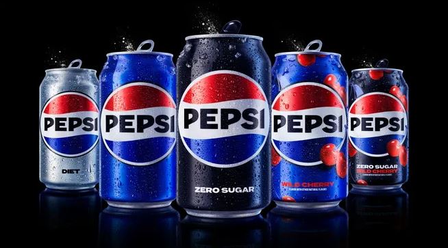
The new design showcases a bold typeface, signature pulse and an updated color palette, including the color black highlighting the brand’s commitment to Pepsi Zero Sugar
“At PepsiCo, we design our brands to tell a compelling and holistic story. Pepsi is a shining example of a brand that has consistently reinvented itself over 125 years to remain a part of pop culture and a part of people’s lives,” said Mauro Porcini, SVP & Chief Design Officer of PepsiCo.
“Pepsi is an iconic brand that is constantly evolving with the times, as it has been a staple in pop culture and disrupted the category for the past 125 years,” said Todd Kaplan, Chief Marketing Officer – Pepsi.
“We couldn’t be more excited to begin a new era for Pepsi, as this exciting new and modern look will drive brand distinction to show up bigger and bolder and help people find new ways to unapologetically enjoy the things they love.”
Brand is Now in Capitals, in the Circle, and With a Stronger Blue Color
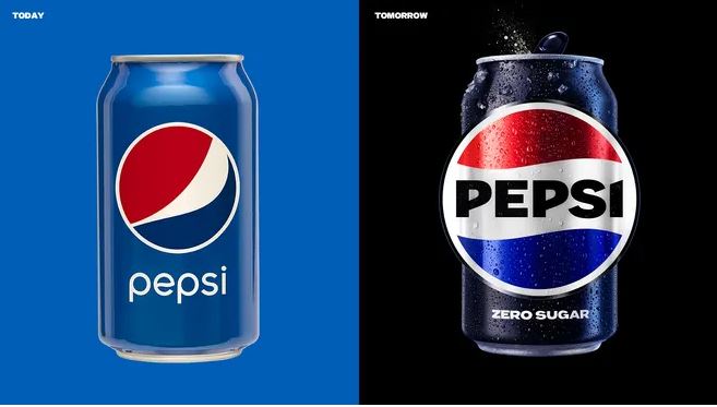
The following before/after image highlights the key changes to the logo.
You should note that the older logo has Pepsi written underneath in all lower-case letters. Which according to Pepsi, “doesn’t exude the confidence and energy that the brand really represents”.
In addition, their focus group research indicated that consumers preferred their past logos where ‘Pepsi’ was placed” inside a globe or a circle.
A Pepsi Video Showing the Visual Changes
The Key “Benefits” New Logo (according to their media release)
- The Pepsi globe and wordmark unite to fit into a variety of settings and emphasize the distinctive Pepsi branding.
- An updated color palette introduces electric blue and black to bring contrast, vibrancy, and a contemporary edge to the classic Pepsi color scheme. Given the brand’s continued focus on Pepsi Zero Sugar, the design brings in the color black, further showing the brand’s commitment to Pepsi Zero Sugar in the future.
- A new visually distinct can silhouette, which heroes the iconic Pepsi can as an accessible brand for all.
- A modern, custom typeface reflects the brand’s confidence and unapologetic mindset.
- The signature Pepsi pulse evokes the “ripple, pop and fizz” of Pepsi-Cola with movement. It also brings the rhythm and energy of music, an important and continuing part of the Pepsi legacy.
What Consumers Think
Here are some comments taken from social media on what everyday consumers think of the new logo change.
Some Positive Comments
- I’m digging this rebrand! Can’t wait for the new look.
- LOVE it! So reminiscent of the logo I grew up with in the 80s and early 90s.
- I really love this new look so much! Now that’s what I call a mix of classic and modern!
- This screams personality, well done Pepsi!
- I don’t like Pepsi but this is an improvement and it could almost convince me to drink it
- Honestly this looks really nice and retro good job Pepsi
Some Negative Comments
- I prefer 2000s logo
- Doesn’t beat the 2000’s logo, but it’s a modest improvement.
- Well, I preferred the old one, but this one reminds me of the classic designs, it’s not bad.
- It looks like a two-year redesigned it…. just like the original logo.
- Changing the logo won’t change that Pepsi is still swill. Coke never changes their label
- The font is awful
- New colors and typeface make it look like a gas station logo.
- Why change a good thing…..have you not learned…change is not always better.
Student Discussion Questions
- What do you think of the new logo? Which one do you prefer?
- Do you think that the logo matters in terms of sales and/or brand health?
- The media release mentions a few reasons and benefits of the new design – which of these are real and tangible (will make a difference to the brand) and which ones are purely cosmetic (or relatively ineffective)?
- In terms of the social media comments – should Pepsi be pleased or concerned – or should they ignore social media because “you can’t please everyone”.
Related Activities

